Website Case Study
Amazing Bora Bora
A one-page Bora Bora guide that takes a traveller from first daydream to packed suitcase, in the colours of the lagoon.
At a Glance
Amazing Bora Bora is a travel information site for Bora Bora and French Polynesia. We built it as a single page that covers the island's appeal, five leading resorts, six excursions, a photo gallery, travel stories, a packing guide, a FAQ and how to get there. Privacy and other policies open as overlays, and a newsletter signup and contact form round it off.
- Project
- Website
- Sector
- Travel and tourism: island destination guide
- Scope
- Single-page guide, from resorts to packing
- Highlights
- Resort line-up, excursions, packing guide
- Live site
- AmazingBorabora.com
The Brief
Bora Bora sells itself in a single photograph; the harder part is turning that pull into a plan. The site had to carry a traveller from the colour of the lagoon to where to stay, what to do and what to pack.
- Lead with the lagoon, the overwater bungalows and Mount Otemanu before any practical detail.
- Put the island's leading resorts side by side, so a couple planning a honeymoon can build a shortlist quickly.
- Present excursions, from snorkel safaris to helicopter flights, as experiences to choose between.
- Answer the practical questions (when to go, what to pack, how to get there) on the same page.
What We Designed
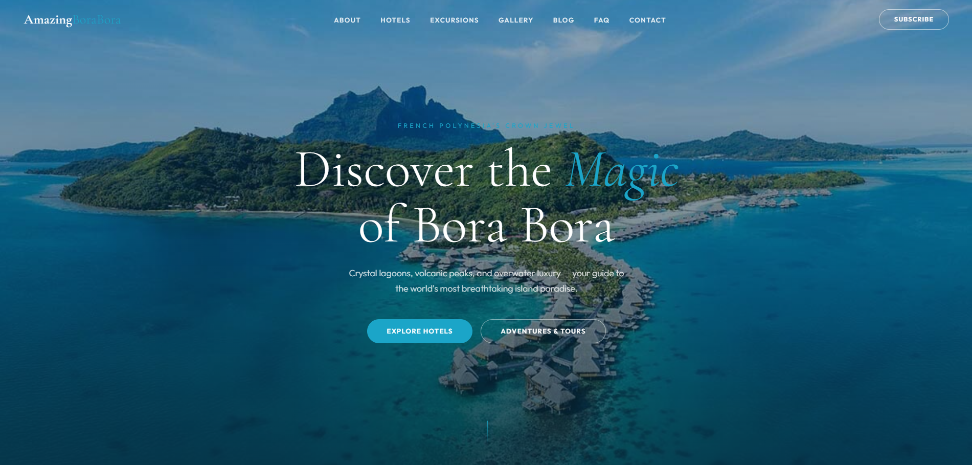
The hero frames Bora Bora as French Polynesia's crown jewel and offers two routes in: hotels, or adventures and tours. Below it, a short introduction and three panels on the island's draw (the lagoon, the overwater bungalows and the adventures) lead into five resorts, six excursions, an image gallery, travel stories, the packing guide, a FAQ and a section on getting to the island.
Cormorant Garamond gives the headlines a light, romantic serif, and Outfit keeps the practical copy crisp. The palette comes from the beach and the lagoon: a soft sand-cream background, warm near-black text and a lagoon turquoise for buttons, so the interface echoes the water without competing with the photographs of it. The tone stays warm and helpful, closer to a well-travelled friend than a booking engine.
Resort line-up
Four Seasons, The St. Regis, Conrad Bora Bora Nui, the InterContinental Thalasso Spa and The Westin, each with its own introduction.
Excursions menu
Lagoon snorkel safaris, jet ski tours, helicopter flights, quad expeditions, helmet diving and sunset catamaran cruises, gathered in one place.
Packing guide
A packing guide organized into clothing, sun protection, water gear and essentials.
Travel stories
Guides to the best time to visit, planning a honeymoon and snorkelling the coral gardens, for travellers still deciding.
How We Achieved It
Everything lives in one index page, so every section is a scroll or a menu tap away, and the photographs are served from the site's own image library. The navigation follows the order a trip takes shape (about, hotels, excursions, gallery, blog, FAQ, contact), and the five policies, from privacy to accessibility, open as overlays rather than separate pages.
The contact form asks for a name, email, phone number, subject and message, and the newsletter needs only an email address; both have spam protection. Email addresses on the page are assembled by JavaScript, which keeps them out of reach of scrapers.
Keep Exploring
More Case Studies
Want a Website Like This?
Let's talk about what your business needs, or start with a custom five-page website for $49 US a month.