Website Case Study
Evening Workout
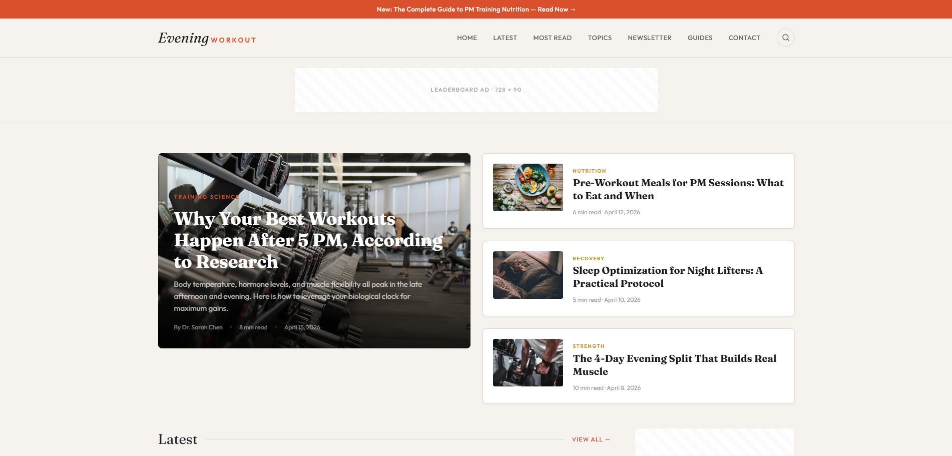
A fitness magazine of our own for people who can only train once work is done, laid out like a front page with every article opening in place.
At a Glance
Evening Workout is a content site we own and operate for people who train after hours. It covers PM programming, pre and post-workout nutrition, sleep and recovery, all framed around the evening. We built it as a single-file magazine: the front page runs through Latest, Most Read, Topics, Trending Now and Expert Guides, each article card opens a long-form article in an overlay, and a working search reaches all of the article content.
- Project
- Website
- Sector
- Health and fitness: evening training
- Scope
- Single-page magazine with article overlays
- Highlights
- Site search, Most Read ranking, eight topic tiles
- Live site
- EveningWorkout.com
The Brief
We set ourselves a specific reader: someone who can only train once the working day is done. Every part of the site had to treat the evening as the starting point for advice on training, eating and sleep.
- Read like a fitness magazine, with a lead story, fresh articles and a ranked list of the week's most read pieces.
- Sort the material into clear topics, from strength and HIIT to sleep, supplements and home gym setups.
- Open every long article over the front page, so readers can finish a piece and carry on browsing.
- Make every article findable through a search that looks through all of the content, not only the titles.
What We Designed
The front page reads like a magazine cover. It leads with the story Why Your Best Workouts Happen After 5 PM, According to Research, with features on pre-workout meals and sleep for night lifters close by. The Latest section follows, its cards showing a category, a reading time, an author and a date, and the page also carries a numbered Most Read This Week list, eight topic tiles, Trending Now and Expert Guides.
Fraunces, a soft and characterful serif, gives the headlines an editorial voice, and Outfit, a clean geometric sans, carries the rest. We kept the background a warm bone white and chose burnt orange for buttons such as Subscribe, a colour that suits a site about the end of the day. The same orange turns up in the favicon, an italic serif E on a dark tile, so the brand holds together even in a browser tab.
Article overlays
Each article card opens a long-form read in an overlay, so the front page is always one close away.
Search across articles
A working site search looks through all of the article content, not just the headlines.
Most Read ranking
A numbered weekly list of the most read pieces, each with its category, reading time and date.
Eight topic tiles
Strength, HIIT, sleep, nutrition, recovery, mobility, supplements and home gym, each with its own place under Topics.
How We Achieved It
Everything lives in one self-contained HTML file. Instead of sending readers to separate pages, each article card opens its long-form article in an overlay above the front page, and About and Write for Us open the same way. A working search covers all of the article content, so someone after advice on caffeine timing or cold plunges can type the question rather than scroll for it.
From the footer, five legal overlays cover privacy, terms of use, cookie settings, legal terms and accessibility. Email addresses on the page are assembled by JavaScript so scrapers cannot harvest them. The PM Digest signup and the contact form are protected against spam with Google reCAPTCHA, and the copyright year rolls over on its own each January.
Keep Exploring
More Case Studies
Want a Website Like This?
Let's talk about what your business needs, or start with a custom five-page website for $49 US a month.