Website Case Study
Live Population Clock
The world's population counted live on United Nations figures, with every country and area ranked, searchable and given a clock of its own.
At a Glance
Live Population Clock counts the world's population second by second and sets it beside a ranked table of 237 countries and areas. The figures come from the United Nations World Population Prospects 2024, medium variant, retrieved through Our World in Data. It is part of our Live network of sites, with the worldwide clock and the country breakdown together on one site, and we finished and launched it in September 2026.
- Project
- Website
- Sector
- Demographics and public data
- Scope
- World clock plus 237 country and area counters
- Highlights
- Live counter, region filter, sortable country table
- Live site
- LivePopulationClock.com
The Brief
A population clock is arithmetic presented as a live event. Our task was to make the number feel alive while being honest that nobody is counting in real time.
- Put the live world total at the top as the page's headline, rising second by second.
- Rank every country and area, with region filters, a search box and sortable columns.
- Give each country its own live counter, one click from the table.
- Be open about the source of the numbers and what a live clock can and cannot claim.
What We Designed
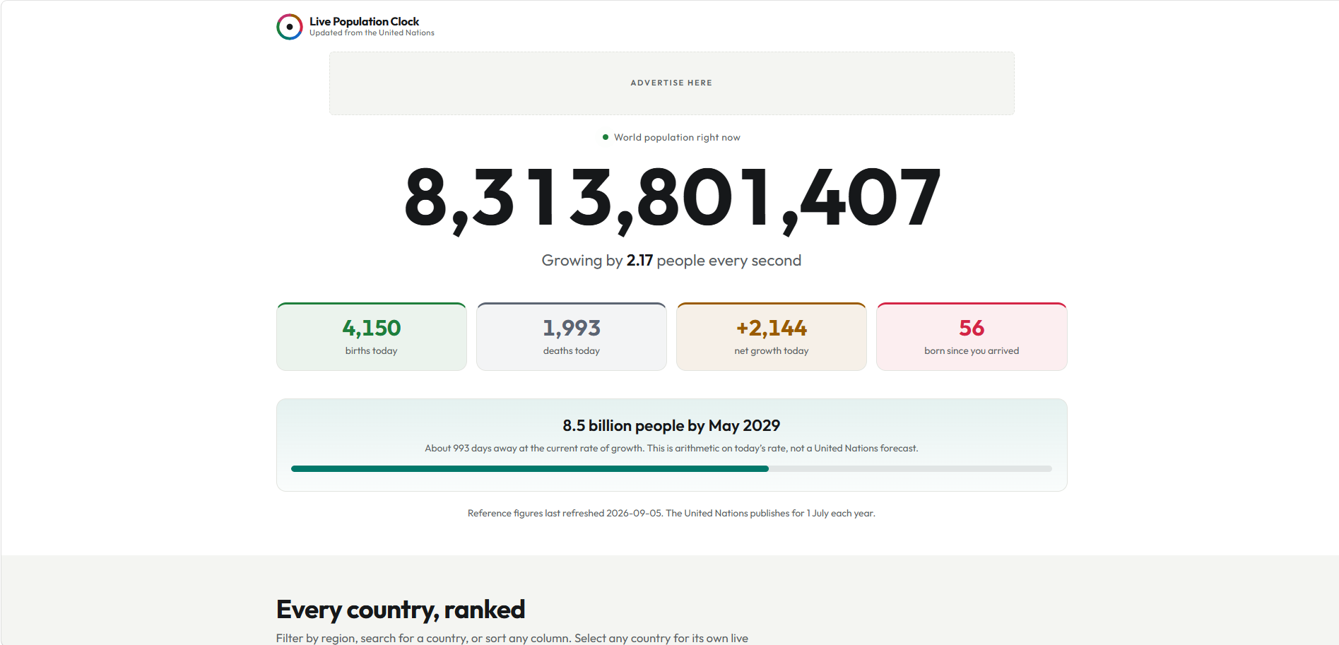
The number is the headline, quite literally: the live world total is the page's main heading. Beneath it the day is broken down into births, deaths and net growth so far, with a small personal touch, the number of people born since you arrived. A milestone line counts down to the next landmark and says plainly that this is arithmetic on today's rate, not a United Nations forecast.
We set everything in Outfit, a clean geometric sans that keeps long strings of digits legible, on a white page with near-black text and almost no colour. The restraint is deliberate: with figures this large, decoration would only compete. The country table follows the same calm treatment, with rank, population, share of world and yearly change set out row by row.
Live world counter
The global total rises second by second, alongside births, deaths and net growth for the day.
Every country, ranked
A table of 237 countries and areas filters by region, searches by name and sorts on any column.
Country clocks
Selecting a country opens its own live counter, at a clean address such as /country/india/.
Credited sources
World Population Prospects 2024 figures, via Our World in Data, are credited under a Creative Commons Attribution licence.
How We Achieved It
The counter works from the United Nations projection for 1 July of the current year and the present rate of growth, so the count is a careful estimate rather than a census. Two sections, Where this number comes from and Nobody is counting in real time, say exactly that, and the page shows the date its reference figures were last refreshed.
The table opens on the 25 most populous countries, with one button to show all 237, so the page stays quick to scan. Each country has its own page at a readable address, giving search engines a clear page per country, and a skip link lets keyboard users jump straight to the counter. The footer carries full attribution to the UN Population Division and Our World in Data.
Keep Exploring
More Case Studies

Want a Website Like This?
Let's talk about what your business needs, or start with a custom five-page website for $49 US a month.