Website Case Study
Napa Valley Winery Guide
A guide of our own to Napa Valley wine country, where a search by varietal, region or experience leads straight to a winery's own page.
At a Glance
Napa Valley Winery Guide is our own directory of the valley's wineries, covering all 17 AVAs. We designed and built it as a multi-page guide: a home page that introduces the region and its featured wineries, a searchable directory, pages on AVA regions and tasting tips, a winery map, a journal, and a detail page for every winery, with each listing's details verified.
- Project
- Website
- Sector
- Travel and wine tourism
- Scope
- Multi-page guide with a directory and winery pages
- Highlights
- Winery finder, 17 AVA regions, verified listings
- Live site
- NapaValleyWineryGuide.com
The Brief
Napa has more wineries than any weekend can hold, so the guide had to help people narrow the field quickly. It also had to be trustworthy, because one wrong detail can spoil a day of tastings.
- Let visitors search every winery by name, region, varietal or type of experience, starting on the home page.
- Make the valley's 17 AVAs easy to tell apart before anyone plans a route.
- Hold every winery to one consistent format, with details that have been checked.
- Keep tasting tips, a winery map and a journal close at hand for planning the rest of the trip.
What We Designed
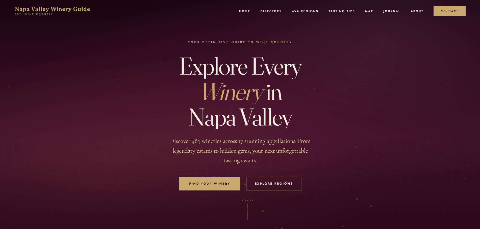
The home page opens with the headline Explore Every Winery in Napa Valley, set in cream over the hero, and two clear paths: find a winery or explore the regions. A strip of headline figures follows for wineries, AVA regions, vineyard acres and family ownership. A short introduction traces the valley from San Pablo Bay to Mount St. Helena, and then come the winery finder, six featured wineries, the AVA regions, tasting experiences and The Napa Insider newsletter.
Type carries much of the wine-country feel. We paired Fraunces, a soft and characterful serif, with Cormorant Garamond for elegance and Jost for clean labels and text. The palette stays close to a cellar door: a warm parchment background, a muted champagne gold on the buttons and a deep, wine-dark tone for the text. Featured winery cards share one pattern (region, varietals, a short description and a link to details), which makes them easy to compare.
Winery finder
Search by name, region, varietal or experience, with quick picks for popular grapes, cave tours and dog-friendly visits.
AVA region guide
A home page section and a dedicated AVA regions page introduce the valley's 17 appellations.
Winery detail pages
Each winery has a page of its own, reached from the directory or from a featured winery card.
Planning resources
Tasting tips, a seasonal guide, a winery map and a journal help visitors plan beyond the first stop.
How We Achieved It
Search sits at the centre of the build. The winery finder accepts a name, region, varietal or experience type, and quick picks such as Cabernet Sauvignon, Cave Tours and Dog Friendly give one-tap starting points. All winery pages share one detail template, so a new listing arrives in the same format as the rest, and the tasting experiences section links to directory views already filtered by experience.
The data had to be right. Every winery in the guide was verified across six data fields, worked through in batches of 20, so the details a visitor plans around have been checked. The newsletter and contact forms carry Google reCAPTCHA and further checks against spam, and each page has a meta description, structured data and a 1200 by 630 Open Graph image for search and sharing.
Keep Exploring
More Case Studies
Want a Website Like This?
Let's talk about what your business needs, or start with a custom five-page website for $49 US a month.